




Slides are not the story.
You are.
Your slides are there to support the journey, not to become the journey.
I often think about slides as the compass that helps steer the session. They help guide the audience through the why, the how, and the what. I often use the Golden Circle thinking for that. Why are we talking about this? How does it work? What does it mean in practice?
But the slides should never become the full script.
They should not be the thing you hide behind.
They should not be the reason you know what to say.
They should be a backdrop.
A visual anchor.
A photograph moment.
A way to make something complex easier to understand.
A way to help the audience remember the story.
But if the screen goes black, the story should still be alive.
Because the real presentation is not in the deck. It is in you.
Slides are the compass, not the driver
A good slide helps steer the journey. It points the audience in the right direction. It helps them understand where they are in the story. It gives them something to hold on to, but the slide should not drive the session. That is your job.
I use slides to support the story I want to tell. Sometimes that means a visual. Sometimes a quote. Sometimes a diagram. Sometimes a single strong phrase. Sometimes just one image that creates the right feeling.
The slide should help the audience think:
Ah, now I understand where we are going.
Not:
Why is there so much text on this screen?
The audience should not be forced to choose between reading your slide and listening to you.
Because if they are reading, they are not fully listening.
And if they are trying to decode a messy slide, you are making them work too hard.
Start with the story
When I build slides, I do not start by asking:
What can I put on this slide?
I start by asking:
What story do I want to tell?
What does the audience need to understand?
What questions might they have?
What moment do I want them to remember?
That changes how you build a deck.
Instead of creating slides as a container for information, you create slides as support for the story.
The story comes first.
The slide follows.
If the slide does not help the story, maybe it does not belong there.
Sometimes a slide is good, but not for that moment. Maybe you prepared for audience A, but you end up in front of audience B. Maybe expectations changed. Maybe the room changed. Maybe the context shifted between the moment you built the deck and the moment you are on stage.
That does not mean the slide is bad.
It just means it might not help this audience in this moment.
And if it does not help, you need to be willing to skip it. But hide it upfront if you can!
The beginner trick: use questions as slide titles
One thing I taught both my children is to use questions as slide titles.
It is a simple trick, but it works beautifully.
Instead of a boring title like:
“Backup Strategy”
Use a question like:
“Why does your backup strategy fail when you need it most?”
Or instead of:
“Architecture Overview”
Use:
“How does this architecture actually work?”
The title becomes the question the presenter needs to answer.
That helps beginners build a story.
They see the slide, read the question, and start answering it to the audience.
And that is much easier than trying to remember a script.
Because if you know the topic, you already know the answer.
The question gives you direction.
It helps you steer.
It helps you stay in the story.
It also helps the audience, because now they understand why this slide exists.
A question title creates curiosity.
A standard title often just labels the page.
And a presentation should be more than a collection of labels.
What makes a good slide?
A good slide can be many things.
- It can be a strong picture.
- It can be a quote.
- It can be a clean diagram.
- It can be one sentence.
- It can be a few words.
- It can be a simple list.
It depends on the story and the audience.
I am visually oriented, so for me a strong picture or quote works very well. But not everyone thinks like that. Some people think in lists. Some people need structure. Some people need a diagram. Some people need the emotional picture first and the detail afterwards.
So when possible, cater for both.
- Use visuals to create emotion.
- Use structure to create clarity.
- Use diagrams to explain complexity.
- Use words to anchor the message.
But always ask yourself:
Is this slide helping the audience?
Or is it only helping me?
That is an important difference.
A slide that only helps the presenter remember what to say is not always a good slide for the audience.
Build for the people in the back
A bad slide is often easy to recognize.
- Too much text.
- No clear colors.
- Tiny fonts.
- Bad contrast.
- Unreadable screenshots.
- A diagram that looks like spaghetti.
- A demo recording where nobody can read what is happening.
- A corporate template fighting against the story.
- A slide that tries to say everything and ends up saying nothing.
Always think from the audience, and not only from row one. Think about the people in the back.
Can they read it?
Can they understand it?
Can they see the important part?
Can they follow it in three seconds?
If not, you may need to simplify.
Use bigger fonts.
Use better contrast.
Use zoom.
Crop the screenshot.
Highlight the important part.
Split one complex slide into multiple slides.
Or remove the slide completely.
A slide that cannot be read does not help you.
It harms you.
Test your slides before going live
Always check your deck before going live if possible and not just on your own laptop screen while sitting twenty centimeters away from it.
Present it.
Put it on a big screen if you can.
Step away.
Look at it from a distance.
Can you still read it?
Can you still understand it?
Does the color work?
Does the image look good?
Does the animation behave?
Does the video play?
Does the screenshot make sense?
If possible, stand five meters away from your screen and look again.
You will immediately see what I mean.
That distance tells the truth.
What looks fine on your laptop can be completely unreadable in a room.
And when you see that, change it.
Help your audience.
Help yourself.
Technical depth versus clean slides
Technical audiences often expect detail.
And they should.
If people come to a technical session, they do not want only fluffy statements and nice pictures. They want substance. They want architecture. They want how things connect. They want consequences. They want the why and the how.
But technical depth does not mean you need to overload every slide.
There is a time and place for everything.
If it is a TED style keynote, I tend to use mostly graphics and phrases that trigger the story.
If it is a deep technical session, diagrams and schemas are needed.
If it is a mixed audience, you need to cater to different minds. Use visuals, quotes, schemas, and sometimes bullet lists. But make sure each slide has a purpose.
Again, know your audience and read the room.
Sometimes you prepared for a technical deep dive, but the audience is more executive.
Sometimes you prepared for a broad story, but the room is full of experts who want to go deeper.
That is where you need to adjust.
The slide deck is not a prison.
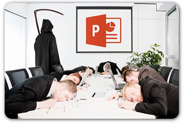
It is a toolbox.
Use the tools that fit the moment.
Visual metaphors make ideas stick
I love strong visuals and metaphors.
They can make a story come alive.
One example I used was a heart.
I had this idea of data being the beating heart of an organization. So I drew a heart on a napkin and sent it to the graphic department.
They turned it into an awesome wired heart, with data streams like zeros and ones running through it, and a pulse showing movement.

One clear image with movement became the intro to a bigger story.
It helped set the scene.
It created emotion.
It made the idea memorable.
That is what a strong visual can do.
It does not only explain.
It makes people feel something.
And when people feel something, they remember it.
Use visuals to trigger emotion and direction
Images are powerful when they have a reason.
Do not use a picture just because the slide looked empty.
Use it to create curiosity.
Use it to trigger emotion.
Use it to explain a concept.
Use it to show direction.
Use it to make the audience remember one important idea.
A good visual should make the story stronger.

If the visual looks nice but does not support the message, it may distract more than it helps.
And be careful with visuals you do not fully understand. If someone asks about it and you cannot explain why it is there, the slide is probably not ready.
Whiteboards belong mostly in workshops
Whiteboards can be great. But for me, they are often better in workshop settings than on a stage. In a workshop, a whiteboard can help you build something together with the audience. It becomes interactive. It can grow with the discussion.
On stage, it depends.
If the room is large, people may not see it.
If the camera cannot capture it properly, online viewers may be lost.
If your handwriting is terrible, good luck.
So yes, whiteboards can work.
But only if the setting supports it.
Again, it always depends.
How to handle diagrams
Diagrams can be extremely useful. They can also be extremely dangerous.
A clean and simple diagram can help the audience immediately understand how something works.
In that case, show it, give them a few seconds, and guide them through the key parts.
But if the diagram is more complex, do not throw it on the screen and start talking as if everyone already understands it.
Remember:
- You may have seen that diagram hundreds of times.
- The audience may be seeing it for the first time.
- So take time.
- Explain where to look first.
- Highlight the important parts.
- Pause.
- Move to the next part.
- Connect it back to the why.
- Then bring it all together at the end.
If you guide people step by step, a complex diagram can suddenly become understandable.
But if you rush, you lose them.
Do not assume the audience sees what you see
This is especially important with technical slides.
As the presenter, you know where to look.
You know what the red arrow means.
You know what that tiny box in the corner is.
You know why the diagram is built that way.
The audience does not.
Not yet.
So help them.
Use animation carefully to reveal parts step by step.
Use highlights.
Use circles.
Use zoomed sections.
Use color.
Use pauses.
Use your voice.
Use your body.
Tell them where to look. If you do not guide their eyes, they will guide themselves. And they may focus on the wrong thing.
Title slides and section slides
The beginning slide should tell people who you are and what the session is about. That is practical. People entering the room can immediately see if they are in the right place. It also helps you!
If time is tight, you do not need to spend five minutes explaining who you are.
It is already on the slide.
Sometimes I use section slides.
Sometimes I do not.
If the presentation is broken into clear parts, section slides can help. They can create rhythm. They can give the audience a moment to reset.
Sometimes I build a presentation almost like acts in a show.
Each act has its own opening, motto, body, and clue at the end.
Then section slides make sense.
But if the story flows naturally, I may skip them. A section slide can interrupt the flow if it does not add anything.
Again, ask:
Does this slide help the story?
If yes, keep it.
If not, remove it.
Agenda slides do not need to be boring
Agenda slides can be useful, but they are often boring.
A standard agenda with five bullet points can kill energy early.
If you need an agenda, make it part of the story.
Turn the agenda into questions.
Show the journey.
Use a visual path.
Use acts.
Use a problem that will be solved step by step.
Instead of saying:
“First we will talk about this, then this, then this…”
You can say:
“These are the questions we need to answer together today.”
That already feels different.
The agenda becomes a promise.
Not administration.
Speaker notes and scripts
I normally do not write speaker notes for myself.
I know the story.
I know where I want to go.
But I do sometimes add keywords, so I remember what I wanted to tell at that moment and can steer in the right direction.
I do write notes when the deck will be used by others.
That helps them understand the story I normally present.
A recording can also help, but slide notes are faster to scan.
If someone else needs to present your deck, do not assume they will automatically understand your thinking.
Help them.
Add context.
Add the why behind the slide.
Add the story if needed.
But for yourself, be careful with full scripts. If you become dependent on the notes, you are in trouble when presenter view fails. And it will fail one day.
Maybe the screen setup is wrong.
Maybe the confidence monitor is missing.
Maybe you only see the current slide.
Maybe someone else runs the deck.
So prepare and practice in a way that you are not dependent on notes.
Know your content. Know your story. Know the journey.
Your deck should not be your only compass
Be ready to present without slides.
I know that sounds scary, especially in the beginning.
But think about it like driving a car and suddenly the navigation stops.
What do you do?
You do not stop forever in the middle of the road.
You read the signs.
You look around.
You navigate toward something familiar.
You use your experience.
Presenting is the same. If the slides fail, read the room.
Use your story. Use your knowledge. Use your experience.
Yes, in the beginning that can be hard, maybe even harsh.
But remember this:
People are not there to see you fail. They want you to succeed.
And if you stay calm and continue, they will often respect you even more.
When the screen fails
I once had a screen turning off every thirty seconds.
At some point, there was no tech support in sight and the screen kept failing.
So I had to continue from memory.
The slides were gone as a reliable support.
That meant I had to describe things in more detail. Normally, the audience would see the picture or diagram. Now I had to create those pictures in their heads.
That is difficult.
But it is also powerful.
Because if you can tell the story without the slides, you know the story is real.
The slides are support.
They are not the foundation.
You are.
Corporate templates
Corporate templates can be useful. They create consistency. They protect the brand. They make things look official. But they can also become heavy, cluttered, too marketing driven, or full of text.
No comment. 🤓
Well, maybe one comment.
I take the best parts from the template and clean up the rest when needed.
If there is too much marketing, too many words, or too much noise, I simplify.
I keep the key components.
I keep what matters for the story they want me to tell.
But I make the deck fit my style.
Because I am the one on stage.
I use slides as backdrop.
I control the story.
I command the room.
A corporate deck should not make you sound like a brochure.
It should help you tell a human story.
Make the deck your own
If you are asked to present a deck created by someone else, do not just open it five minutes before the session and hope for the best.
- Go through it.
- Understand it.
- Challenge it.
- Remove what does not fit.
- Add the story.
- Simplify where needed.
Ask yourself:
- Can I explain this naturally?
- Does this sound like me?
- Do I understand every visual?
- Does this slide help my audience?
- Do I know what to do if this slide does not land?
If the deck does not feel like yours, the audience will notice.
You do not need to redesign everything.
But you do need to own it.
Tools and techniques
I use PowerPoint. Always. And I am pretty good with it.
Actually, I have built complex diagrams in PowerPoint that probably should have been made in Visio, but the tool itself is not the most important thing.
PowerPoint, Keynote, Canva, whatever you use, learn the tool.
- Explore it.
- Go deeper.
- Understand what it can do.
- Learn how to align objects properly.
- Learn how to use guides.
- Learn how to crop images.
- Learn how to use layers.
- Learn how to export to PDF.
- Learn how to embed or link videos correctly.
- Learn how animations behave.
- Learn what can break.
Because when you master your tool, you can focus more on the story. The tool should not slow you down.
It should help you create.
Be careful with effects
Animations, videos, movement, transitions, and builds can all help. But they can also hurt.
If an animation supports the explanation, use it.
If it reveals a complex diagram step by step, great.
If it creates energy at the right moment, perfect.
But if it is only there because it looks cool, be careful.
Too many animations can make a presentation feel childish or chaotic.
Videos can fail.
Embedded media can break.
Fonts can change.
Transitions can behave differently on another machine.
So use effects with purpose.
And always test them.
Especially on the machine that will actually run the deck.
Beginner advice: reduce, enlarge, simplify
If you are new to presenting, focus on these things first.
Reduce text.
Use bigger fonts.
Create more white space.
Remove unnecessary bullets.
Use better contrast.
Make screenshots readable.
Use questions as slide titles.
Build the story before building the deck.
Practice without staring at the slides.
Ask someone to review the deck from the audience perspective.
And present your slides on a screen, then step away five meters.
That single exercise will teach you a lot.
If you cannot read it from there, the audience probably cannot read it either.
What presenters should avoid
Do not read of your slides. People can read and if you read to them, they may wonder why you are there.
- Do not stand with your back to the audience while talking to the screen.
- The screen is not your audience.
- Do not overload slides with text.
- Do not use unreadable screenshots.
- Do not use diagrams you cannot explain.
- Do not use visuals only because they look nice.
- Do not use animations that break the flow.
- Do not depend on notes so much that you freeze when presenter view is gone.
- Do not assume the final deck works.
- Check it.
Especially if it was copied into another deck or corporate template.
And do not forget that a slide should earn its place, if it does not help the story, remove it.
The key lesson
If there is one thing I want you to remember from this part, it is this:
Your slides are not the story, they are the compass. They help steer the journey, but you are still the one driving. A good slide gives the audience something to hold on to. A picture. A question. A quote. A diagram. A moment they remember later.
But the real story should live in you.
Because one day, the screen may go black.
The demo may fail.
The formatting may break.
The animation may not work.
The presenter notes may disappear.
And then what?
Then you breathe.
You look at the room.
You read the signs.
You use your experience.
And you continue the journey.
Because the audience did not come to watch your slides present.
They came to listen to you.
So build slides that support you.
Use visuals that help the story.
Make complex things easier.
Create memory anchors.
But never let the deck become the presenter.
The slides are the backdrop. The story is yours. And the room is waiting for you to bring it to life.